Helping local community take part in running their city
- Industry: Development agency founded and owned by the City of Split
- Location: Split, Croatia
- Service: Brand Design, UX/UI Design, Web Development, Maintenance
Creating a touchpoint between the people and their elect officials
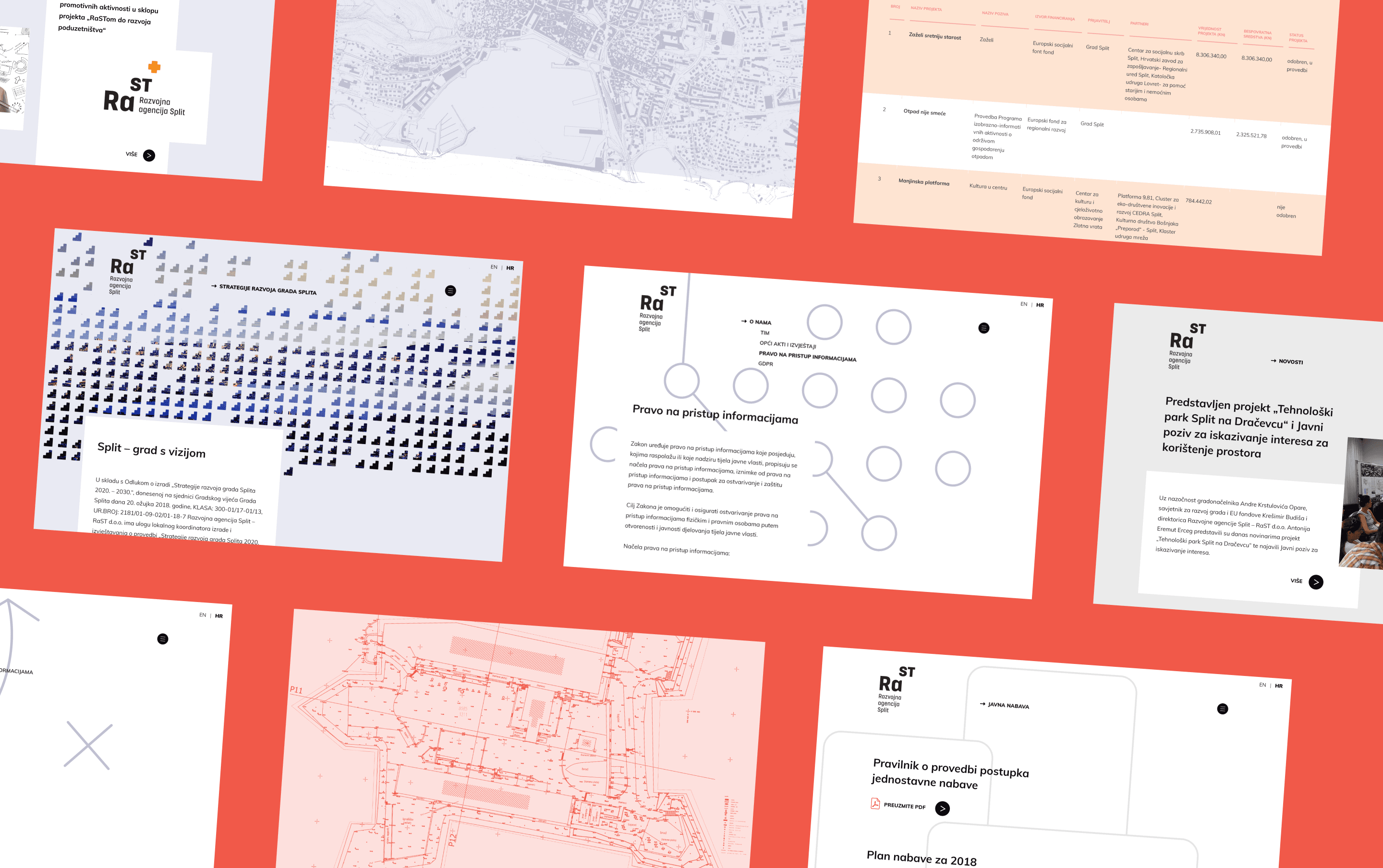
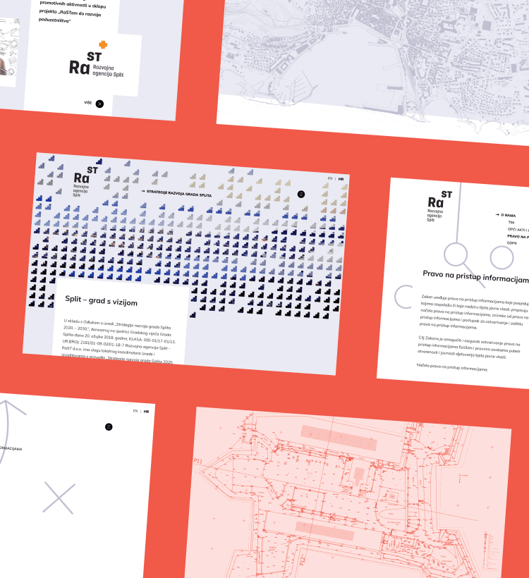
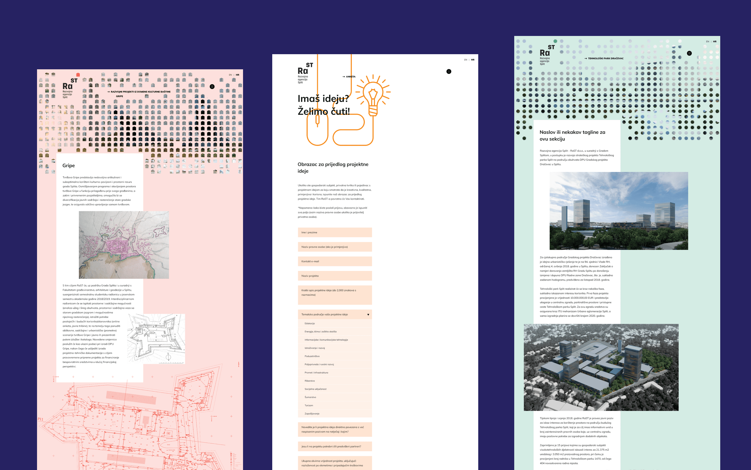
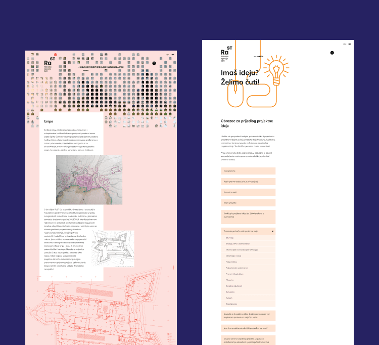
When the city of Split founded their development agency, it wanted to include members of the local community in the shaping of the future and make all of its processes transparent and available to all. The problem was, most of their content was various reports, documents, white papers, tables and figures. How do you make something so boring visually appealing?
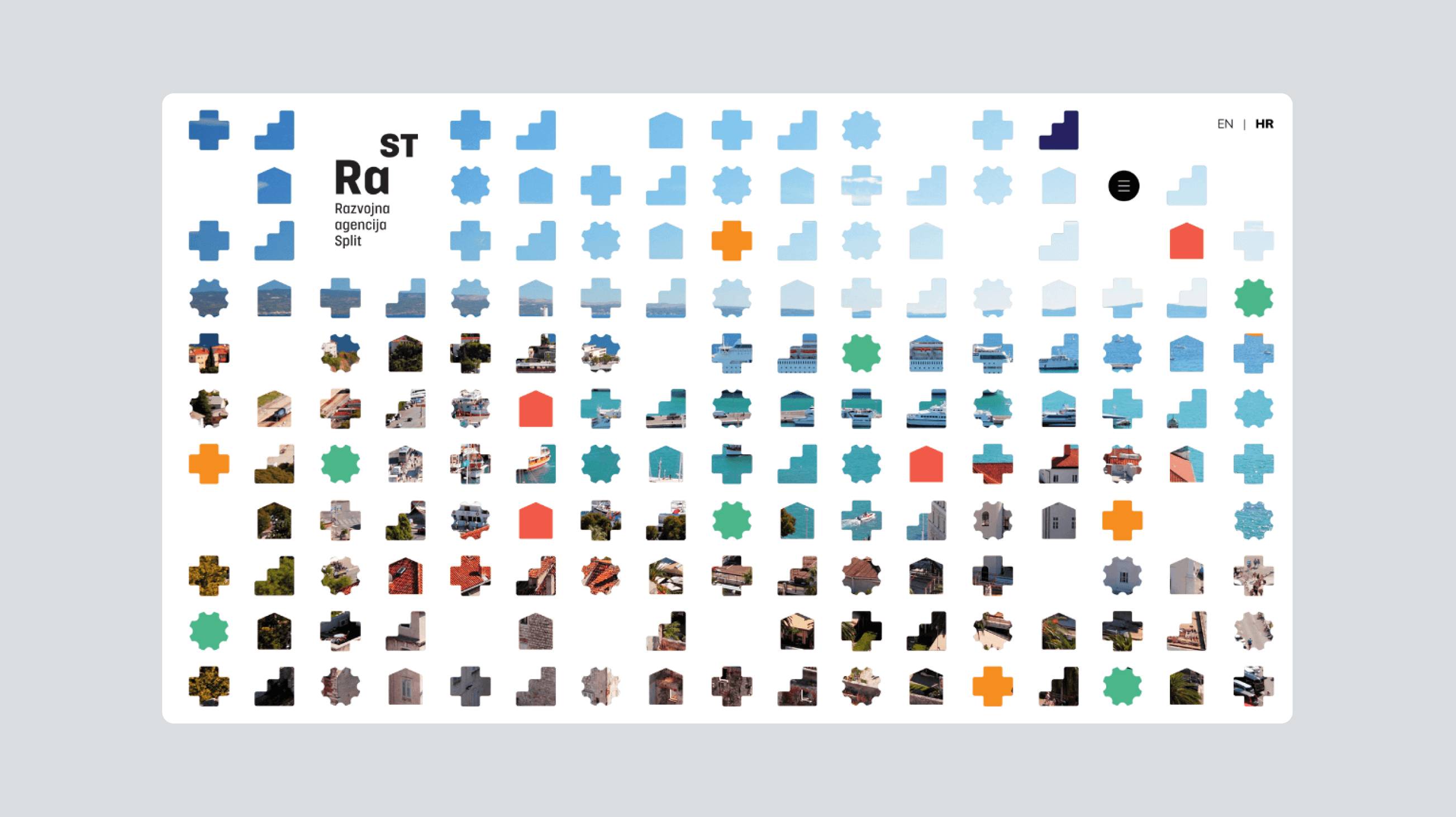
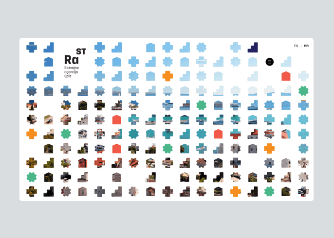
Make formal fun
If you want to liven up a boring government website start with a simple colour palette and make it modern through edgy, but accessible typography, so it inspires exploration and feels good even if you spend too much time digging for the information you want.
Encourage engagement, simplify wayfinding
Rast website had to inspire users into joining the discussion, reading the documents and checking the figures so interactivity was high on our priority list. To help users find what matters to them (because in our world, the user is king) we visually blocked sections that had a background image and patterns across the website.
Inspiration thrives on challenges
Turning what was initially a huge folder of documents, tables and numbers into a visually appealing website that invites interaction and encourages users to explore was a huge ask, but we are extremely happy with the results. RaST website turned out extremely easy to read, with visually appealing pages full of data - and what is most important, it works wonders, since community interaction has been on a steady rise from launch.
Explore Our Other Case Studies
Beautifully showcasing an architect's work
Building an innovative global tech ecosystem
Let's work together to shape your ecommerce future.
Get in touchCareers
- Looking for a job or have a question?
Don't be shy and let us know!